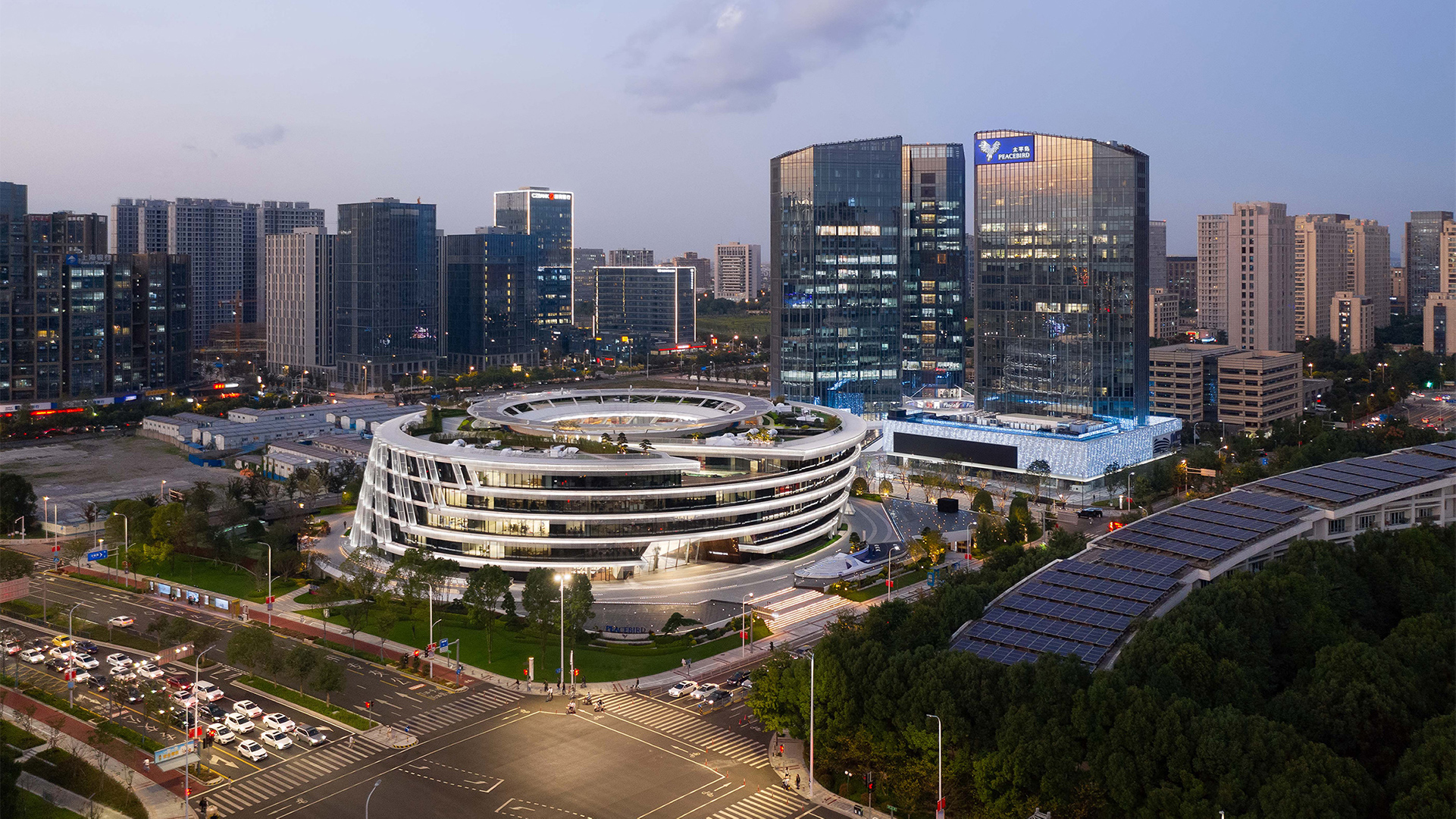
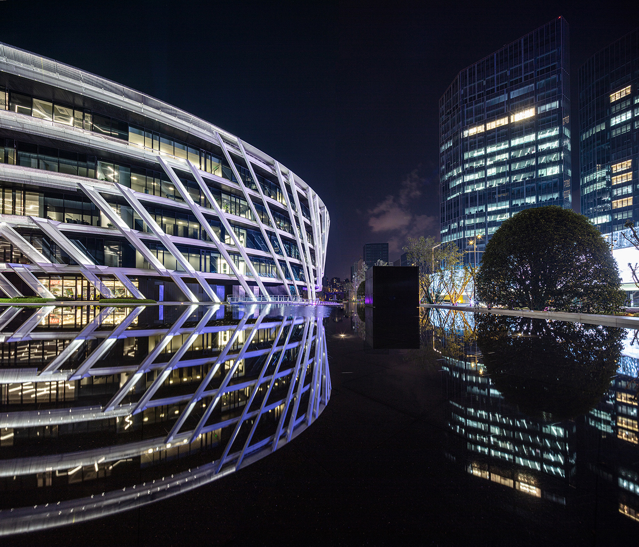
Designing a 78, 500 m² fashion headquarters challenged us to respond by creating spaces and a building that not only function in the traditional sense of an office space but a space that can inspire, be healthy, be creative and have flexibility. Like all sites we had local regulation and constraints to design too one being a maximum height of 24m and required building line set backs. We aimed at the outset to design and create a sequence of spaces that “unifies” the company and furthermore make the environment a “home” and “creative hub” to enjoy your work and enhance the interaction and dialogue with the people around.
The site is located at the “heart” of the new CBD in the Chinese City of Ningbo (meaning “calm waves”), and is a major port and industrial hub in East China’s Zhejiang Province. It is South of Shanghai on Hangzhou Bay and is home to the 1516 landmark Tian Yi Ge from the Ming dynasty, one of the country’s oldest libraries. In its prime, it boasted a collection of 70, 000 volume of antique books. We felt it necessary that the design should have both the DNA of the company brand and be a 21st Century manifestation of its enriched local Chinese past.
“PeaceBird” was named by the Founder and Chairman himself to express the fashion brand ideology of being “harmonious and free as a bird” in expressing yourself through fashion. He wanted this also to be expressed in our design. Capturing this spirit in the conceptual design and fuse it with local cultural filters became the challenge as well as bringing together the tectonic and sustainable qualities of the architecture. After considering many approaches to the project we had a strong sense of feeling that this building should express itself from the inside out through a sinuous movement of connected spaces. It pulled together cohesively the design palette we collated by filtering images and geometry of :
- Ancient Chinese radial architecture synonymous to the nearing local province of Fujian;
- The physical layering of walls and screens of the landmark Tian Yi Ge, celebrated at its epicentre by the spiraling golden timber dome;
- The client’s wish of expressing the brand DNA of being ‘harmonious and free as a bird’, with the flight of a bird itself effortless to the eye on an invisible lift of thermal air. An air thermal is a sinuous helical and efficient natural air uplift that begins from varying ground conditions and the bird will harness this condition for glided flight.
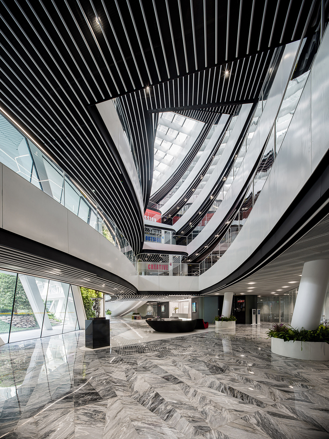
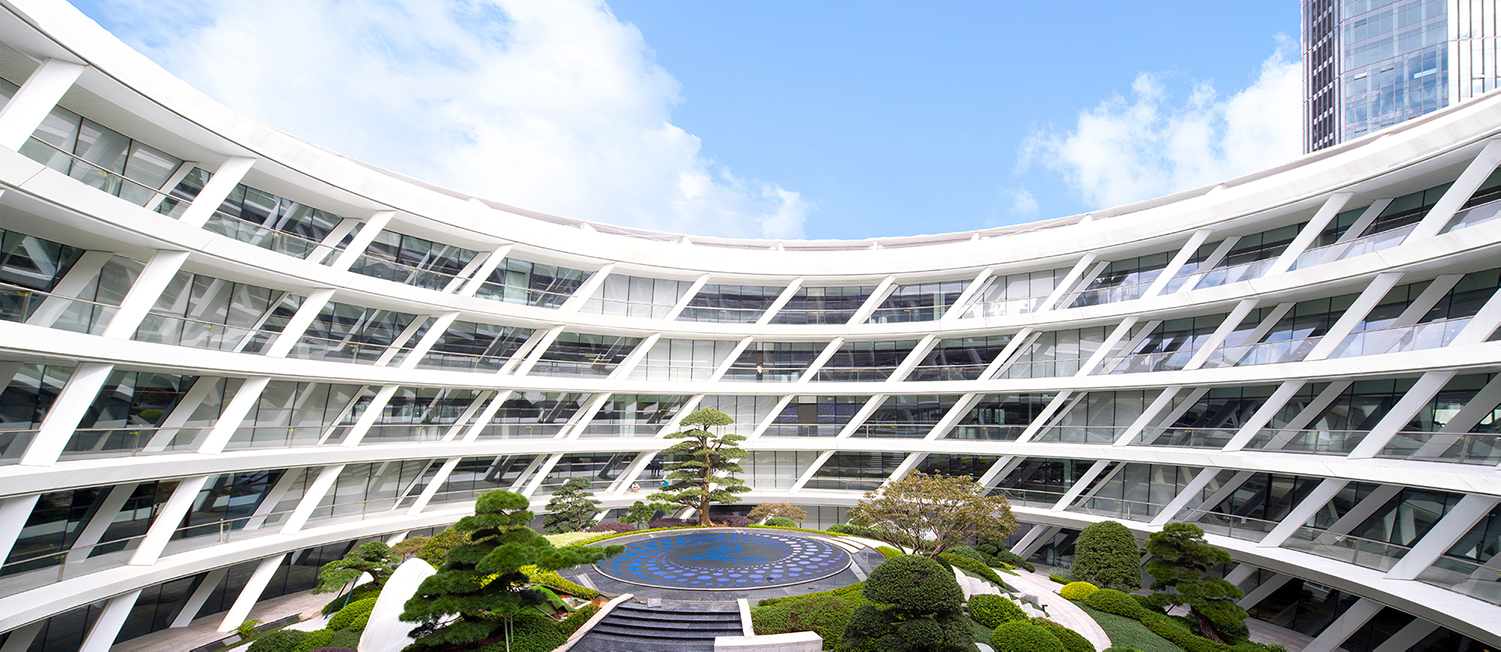
The “thermal” takes on a spiral shape in plan and then stretches this upwards vertically in form. These geometric templates gave us a very strong framework that integrated functionality, sustainability and architecture. A circular plan arrangement evolved through design studies by creating a central garden at its epicentre (like a modern day interpretation of the concealed Chinese garden) that created “ringed/layered thresholds” that order the space from internally (community) to its peripheral.
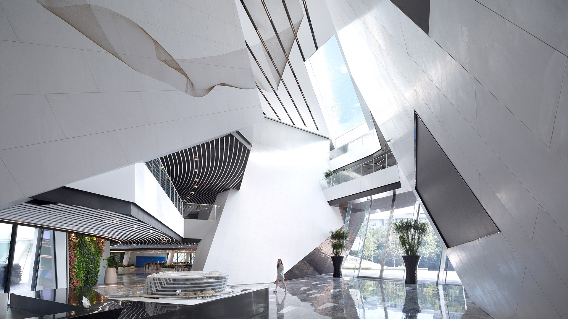
We then applied environmental studies to the massing and conceptual arrangements discovering that if we tilted the mass 15° due South the daylight factors for the internal spaces annually were greatly increased providing enhanced working conditions. The combination of the sinuous helical circulation path and tilting mass generated a dynamic and expressive architectural language both within and externally. Voids within the floor plans were twisted around their centroid to form a kind of “kaleidoscopic” connection of spaces yet further yielding a connective working community.
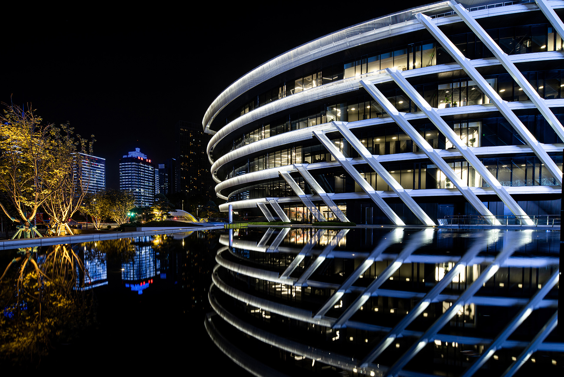
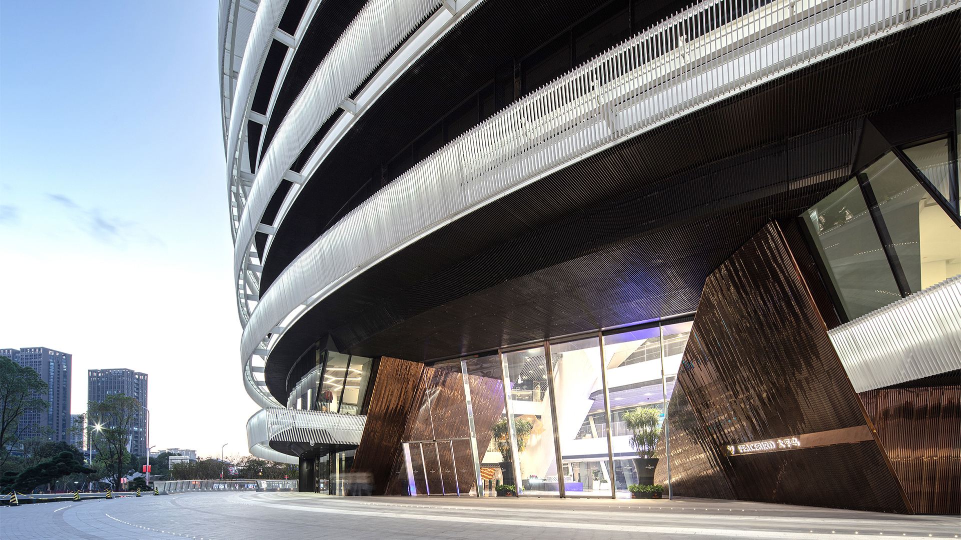
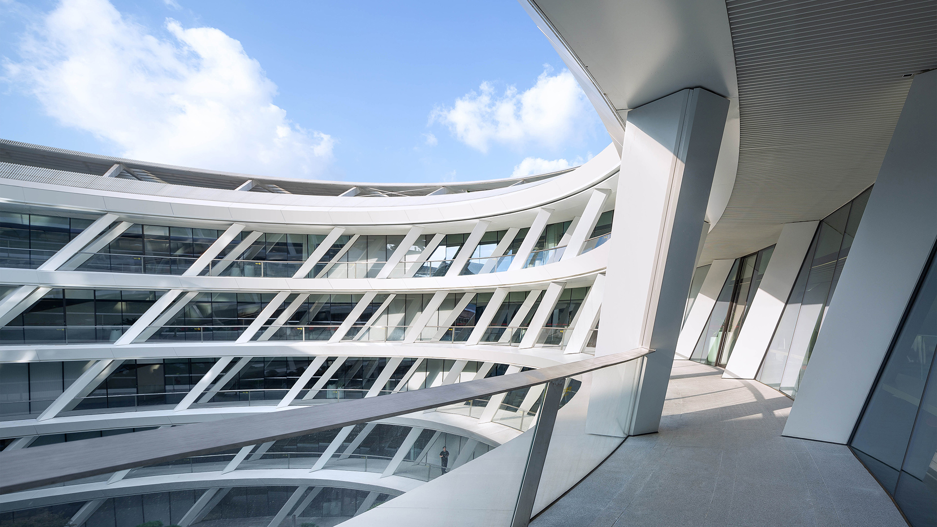
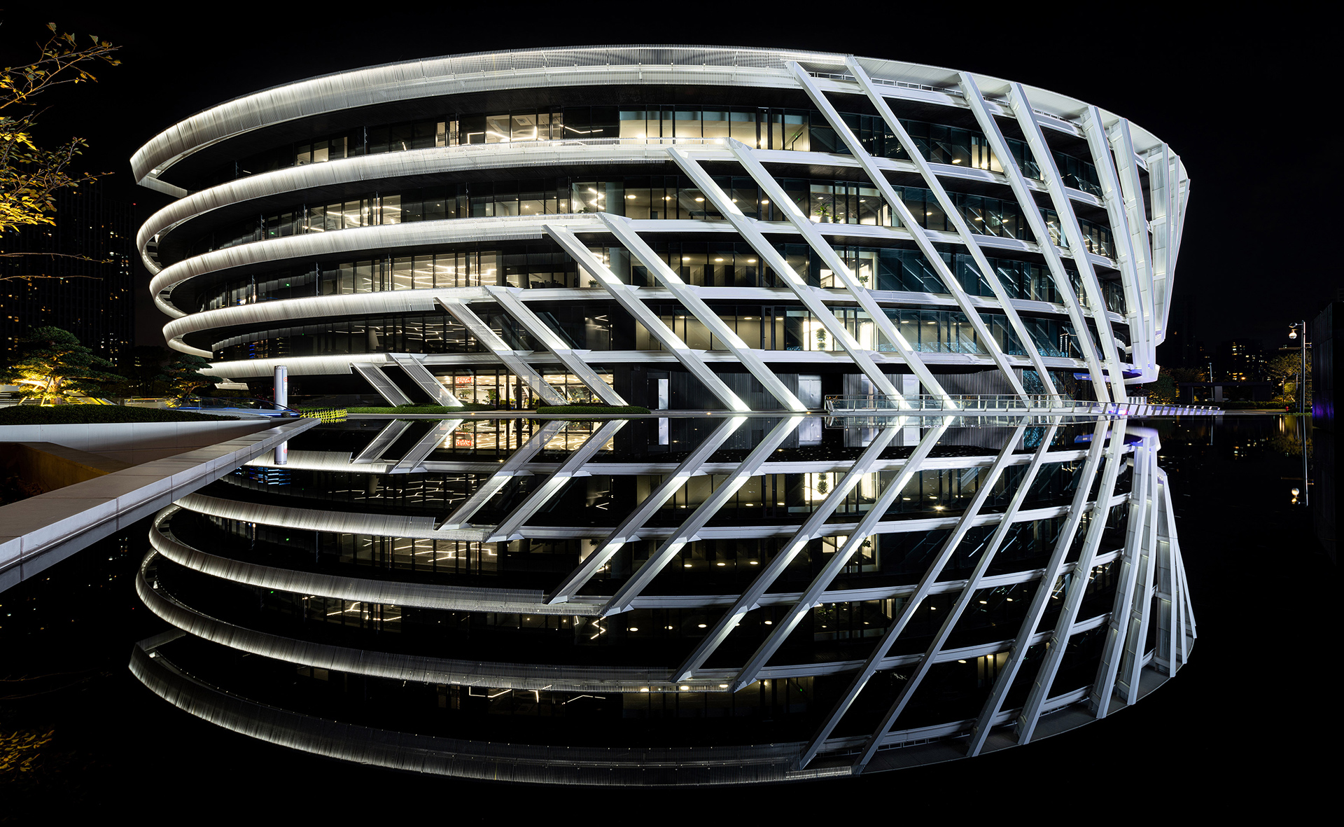
The facade studies through experimentation both externally and internally felt most natural and holistic as an expression of the acquired design language. External and Internal facade systems shared a common geometry of rotation and torque through the envelope surface but were designed to perform differently due to the structural and solar impact requirements. The 110m diameter external facade responds to the orientation of the solar path as it passes around the building throughout the day. We wanted to give the client optimised views and avoid the typical norm that offices have with their internal localised blinds that give an overall messy external aspect and appearance. This we overcame by designing and combining two facade systems:
- Firstly, the glazed weather sealed threshold which provides floor to ceiling transparency and optimised daylight with intermediate vertical pivot vents for natural ventilation;
- Secondly, a secondary system for shading locally on the external structure. There is a “horizontal condition” for the sun’s highest and warmest positions in the day and also a “diagonal condition” for the sun’s lower morning and late afternoon positions.
The fusion of these systems resulted in a slip streamed and articulated geometry that has an efficient and expressive facade to shade, ventilate and moderate the internal temperature of the building. It gives the building its own identity and creates a rhythmic classical colonnade at ground level that provides the human scale and feel to the building.
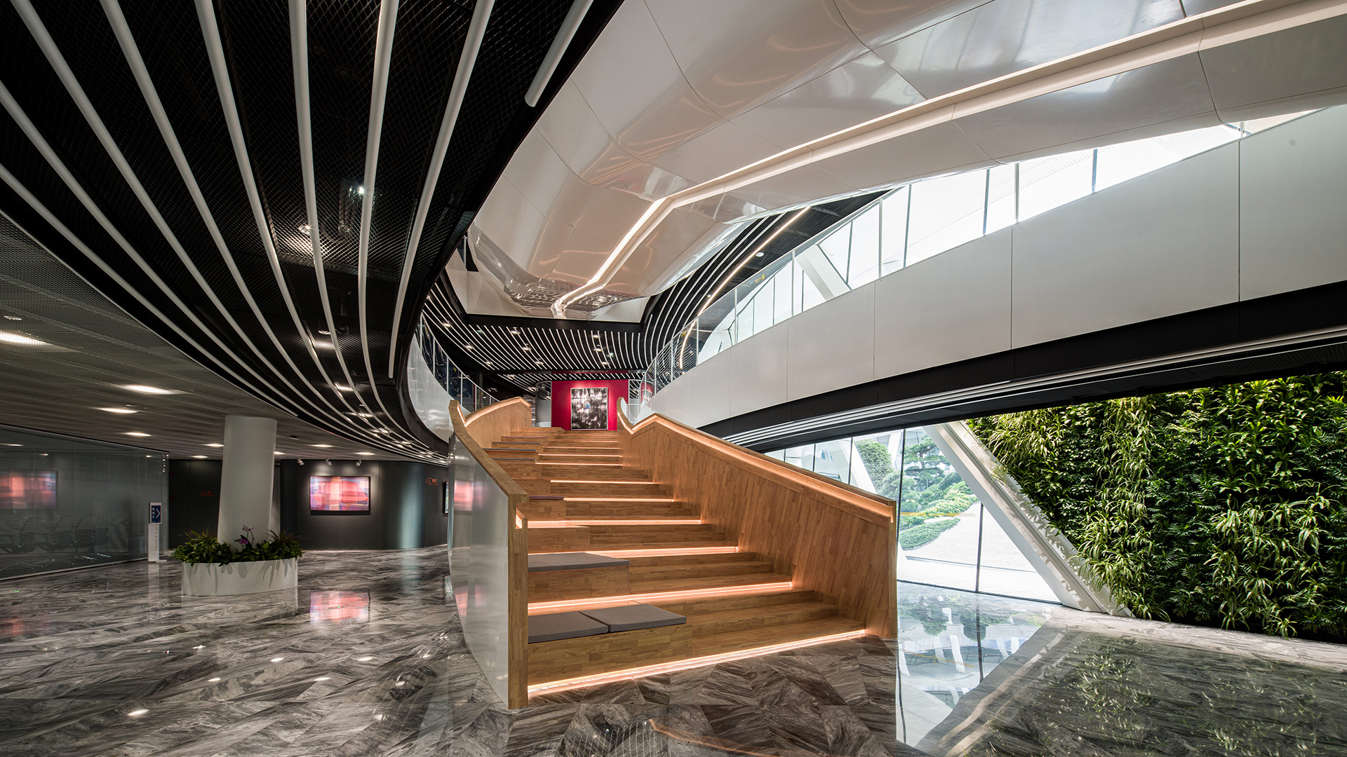
The internal facade takes it one step further by being also structural. This provided the client with more open plan flexible space. It omits unnecessary and ill-considered design but instead becomes a symbiotic structural and architectural solution that graces the internal aspect. The facade envelope is double layered and is set-out on the surface of the torsional cylinders. This connected double layer acts as large columns to take the spanning and heavy dead and live loads of the internal floor plates and “super staircases.” This solution creates an elegant rotating and twisting form that has a circular “gallery” that views down on to the gardens and terraces below. The facade provides shade and natural ventilation similar in study to the external facade. The design and engineering rigour creates a seemingly effortless optical relationship between this facade and the internal spaces and circulation.
The central garden acts as a “lung.” It is the space that is revealed progressively on approach from the entrance and where offices have views and people can relax when they need take a break. It takes the same holistic approach as the office spaces and circulation by creating a sinuous movement through two floor levels. It has water features that run around the periphery and three small waterfalls that drop from the three landscaped and catwalk “fins” arrayed around the central grid. Terraces for coffee and meetings populate the spaces within this oasis.
The garden structure also “crowns” the spaces below in the basement of the project with its 50m, clear-spanning dome form. Exhibition, conferences and fashion shows host this large space. Reception zones, restaurants, cafés and bar areas and auditorium are located around the central space as it performs a more public and staff servicing function. They are all accessible by the main cores , grand reception staircase and staff access stairs from street level. Bike storage, staff reception, maintenance, delivery and rest room facilities complete the remaining accommodation at this level. The additional two basements are for parking and mechanical plant.
The landscape finally resonates through the building to the external site where the geometry echoes the movement and energy created from the spaces within. The tangential geometry from the loop sculpts the landscape and provides gradients and textured surfaces of plants, water and access roads. This architectural treatment covers the site allowing shade and camouflage for the pedestrian, vehicular and bicycle users. It is the final piece of the concept that “frames” the view of the HQ Building giving it a “spirit, energy and expression of the identity for our client, PeaceBird.”
“Fashion is in the sky, in the street, fashion has to do with ideas, the way we live, what is happening.”
– Coco Chanel
2015-2019
PeaceBird Group
78, 500 m²
Ben Ashford, Mark Chén, Simone Cherchi, Bryan Crossland, Tanya Eskander, Annie Feng, Angela Foo, Jack Howell, Xin Huang, Russell Murrell, Daniel Statham, David Tao, Kate Xie, Jennifer Zheng
Atelier One
Atelier Ten
Eduth
Palm Design
Jianke Shanghai
CSCEC
TAL


